Sunday, April 11, 2010

Promiscuous

Wow! It's been months since I've posted something. After making somewhere close to 100 cards for Christmas, I was a little burnt out and took a bit of a break from creating. Well, not that long of a break but my crafting time has been sporadic since the new year, mostly when I needed a card for an occasion.

So, this was one such occasion. My sister and brother-in-law asked me to make a card for friends who just had a baby girl. As I was thinking of the card layout, I realized that I really couldn't settle on any one style. Sure, a card for a baby girl should be cutesy but that's not my usual style. So I made three cards utilizing three different styles and left it to my sister and bro-in-law to choose one.

Elegant

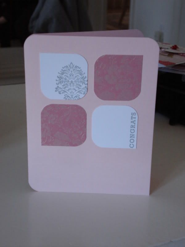
This is the first card I made. I saw a card on SplitCoastStampers that used this layout and I loved it. So simple and elegant. So I took the layout and changed up the colours, papers and stamps. Doesn't exactly scream 'baby girl' but hey, at least it's pink and oh so pretty. Damasks are awesome.

Vintage

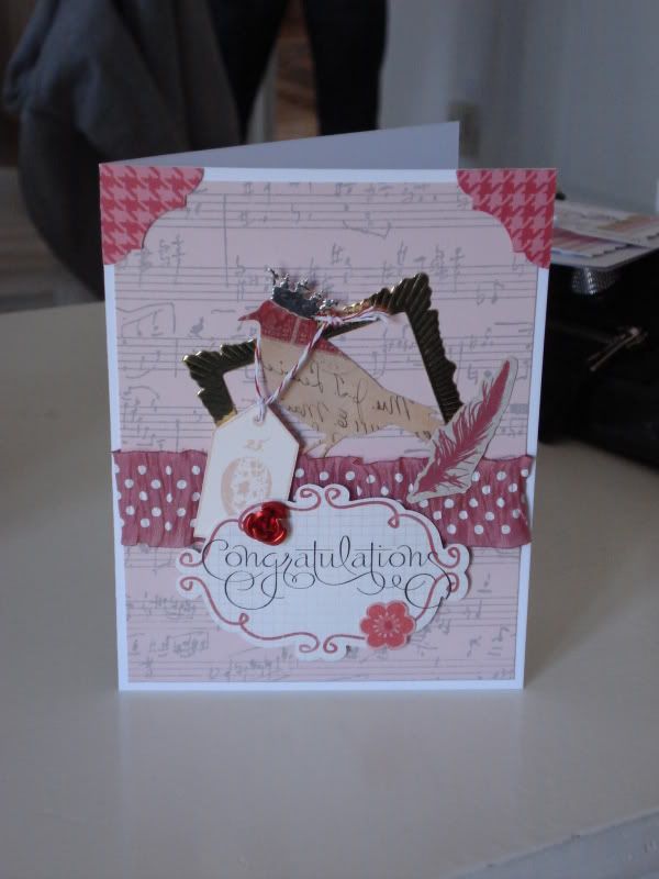
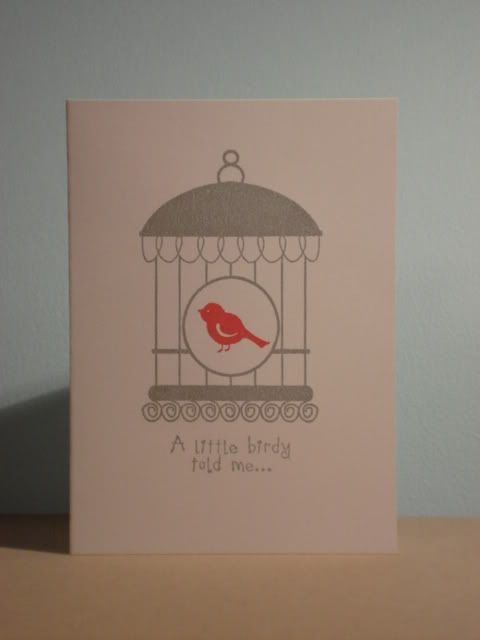
I love vintage stuff. It's so different from the clean and simple designs that I normally like but I can't help ogling vintage-y stuff. Although these collage cards look like they're just thrown together, it actually took me a while to figure out how to place the various ephemera (man, I love the word, 'ephemera'). I still can't decide on whether I should have added photo corners to the bottom of the card as well. On the one hand, I think I would like the balance. On the other, I didn't want the card to look too put together. Now this card really doesn't scream 'baby girl' but I incorporated a bird and egg. That's kinda symbolic, right?

Cute

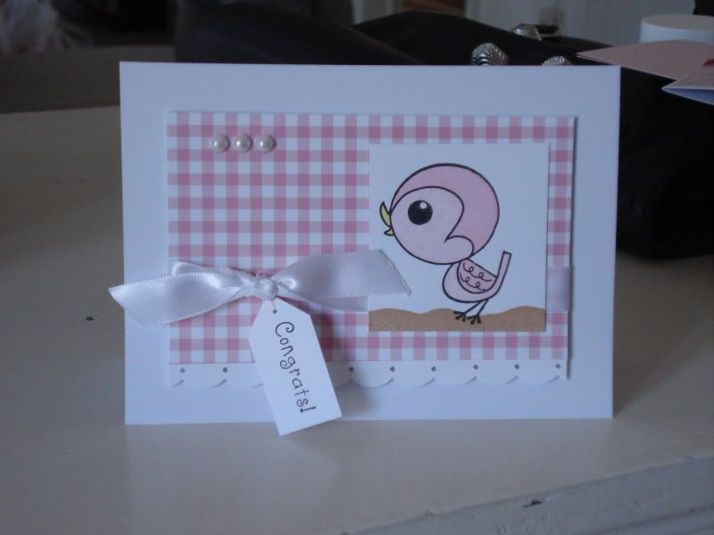
Okay, so I finally made a cute card that was baby-appropriate. I've had that cute bird stamp from Imaginisce for over a year and never used it once. I think I did a pretty good job of 'cute', don't you think? The top left corner was looking a little barren so I added three pearls. I was originally going to use black pearls to create a visual triangle out of the black elements on the card but that's probably a little too morbid for a baby card. So now I have a white visual triangle. Kinda works, right?

So, here are three very different cards using three very different styles, none of which I can decidedly say I am committed to (you didn't think the title of this post was referring to my love life, did you?). Can you guess which one sis and co. chose?

Elegant:
Stamps:Unity Stamp Co., Papertrey Ink
Inks: Tsukineko Memento
Paper: Cardstock - Stampin' Up!, Papertrey Ink; DP - SEI
Other supplies: Medium corner rounder

Vintage:
Stamps: Stampin' Up!, Character Constructions, Impression Obsession
Inks: Papertrey Ink, Tsukineko Memento, Tim Holtz Distress Ink
Paper: Cardstock - Stampin' up!, Recollections pre-scored cards
Other supplies: Ephemera - K & Company, Making Memories; pop dots

Cute:
Stamps: Imaginisce, Darcie's, Papertrey Ink
Inks: Tsukineko VersaFine, Papertrey Ink, Stampin' Up!
Paper: Cardstock - Papertrey Ink, Recollections pre-scored cards; DP - Jillibean Soup
Other supplies: Pearls - Recollections; Ribbon - Papertrey Ink; Border Punch - EK Success; Markers - Tsukinedo Memento, Marvy Uchida; pop dots

Sunday, January 3, 2010

Comment on the last post

I just read through my last post again and realized that the watermelon on the last card should have been stamped 180 degrees from how it's currently positioned. With the point of the watermelon slice pointing downwards, it actually looks more like a slice of pizza now than a slice of watermelon. Hmm...perhaps I just discovered a way to make this stamp a two-for-one. I wonder if I change the colours whether it will look like a slice of pizza...

Variations on a Theme

Lately, I've seen a lot of cards that employ the use of a marker or pen to draw borders around (or even through) images and sentiments, and decided that I wanted to try this technique. So below is my variation on this technique. I have to say, I really like it. Now if only I can perfect it so that I don't end up with lines that look like this:


This is the first variation on the technique whereby I'm using a black ink pen to draw the border, incorporating the stamped image into the border.


I like how clean this looks. It takes a pretty plain card and completes it. I like white space, mind you, but too much is just...too much (I don't know how else to word it).

The next variation has the image stamped on a layer outlined with marker and layered on coloured cardstock.


I like it but I'm not as wild about it as with the first variation. Perhaps the layer is too small, the outline too thick, or the sentiment is stamped in the wrong place, but there is something not quite perfect about this design. Not to mention that the image did not turn out as solid as I like but more about that in a later post.


The final variation is perhaps my favourite. I love the look of clean lines but there is something to be said about lines drawn free hand that add just that bit of whimsy to a card.


I first saw this done on a card in the Winter 2010 issue of Stampers' Sampler Take Ten and loved it. The imperfect lines fit perfectly with the hand carved stamps I got off Etsy, which are slightly imperfect, and the scripted sentiment from Papertrey Ink, which is slightly imperfect also. It is very difficult for me to get away from the ruler and measuring everything out and making sure it's perfect but the free hand was actually quite liberating. My usually ugly uneven lines actually ended up looking good on something.


I think this is a technique that I will be sticking with for quite a while. There are variations that I have yet to try and am dying to. For instance, I think it would look really cute to sew the lines in the first card above rather than drawing it. But then again, I need to learn how to sew first. *sigh*

Ciao for now.

Sunday, December 13, 2009

Mass production

We're well into December now and the holiday season. I actually started my Christmas cardmaking very early this year, buying my Christmas papers and supplies right at the beginning of November. However, most of the 50 or so cards I've made so far have either been donated or sold to other people. I left none for myself! So I needed to get lots of cards done and fast! Creating unique designs for each card would've taken forever, so I resorted to the mass production method of one simple design.


I first created a prototype of the cards I wanted to make (which will soon change slightly). I'm a novice when it comes to mass production but I've learned that prepping in advance always saves time. Here, I have all my layers pre-cut and embossed and have the ribbon cut to length. To further save on time, I used the pre-cut, pre-scored cards from Michael's, which were on sale this week.


A little Scor-Tape here and there et voilĂ ! Twenty-two fabulous cards. I changed the position of the circular sentiment and switched the ribbon for this wider sheer and satin one. I felt the design of the card called for a wider ribbon (and shiny satin always seems so festive to me).


And here is the card in all its singular glory. I'm quite happy with it and feel that it is a design that my friends and family will appreciate too.

And now to get on writing in them...

Supplies: Bazzill, Cuttlebug embossing folder, Just Rite stamps, Nestibilities, ribbon from Michael's

Sunday, December 6, 2009

Simplicity


I go through phases where different styles of stamping and cardmaking catch my eye. At first, it was all about building embellished cards that were loaded with patterned papers, chipboard, flowers, brads - anything. The more layers the better. Then, I fell in love with all the techniques you can do with Tim Holtz's Distress Inks, vintage effects and vintage images. Actually, I still love all things vintage. But the new thing I currently adore is 'clean and simple.' This usually means creations I can make with just one or two silhouette stamps, some coloured inks, and a white card base. I love how the card above looks like it's been screen printed. Simple is best.

Friday, December 4, 2009

Holiday Silent Auction

My workplace is holding a Holiday Silent Auction to raise money for the Student Endowment Fund. I volunteered to donate two card collections to the auction - one Christmas collection and one All Occasions set. I hope they do well and we're able to raise some money for the students.

Here are the card purses I made to hold the cards. They are sets of 10 cards each.

Thursday, December 3, 2009

First Post


I've been crafting for about a year now and I figured it was about time I started joining the online world of stampers and card makers. I've been lurking on people's blogs and on splitcoaststampers for long enough. Time for j.why to break out on her own and give others the chance to lurk on her blog!

Yes, j.why likes to refer to herself in the third person.

And so, stay tuned if you're interested in what I make.

- j.why